

We are going to talk about color today! This is something I struggle with the most when I’m working on my cards. I usually reach for the most common pink and yellow color combo, only to stop myself and realize there are so many other wonderful colors and color combinations out there!
To help me be better with color, I decided to challenge myself to study color by exploring new color combinations and trying them out on my cards. I hope you’ll join me in this adventure! If all goes well, I’ll turn this type of video into a series. Let me know in the comments what you think and if you find this useful.
Like this project? Pin it and save for later | Curious about my project photography? Click for details.
VIDEO TUTORIAL
Watch the video below or on my Youtube channel.
MUTED GREEN & PURPLE
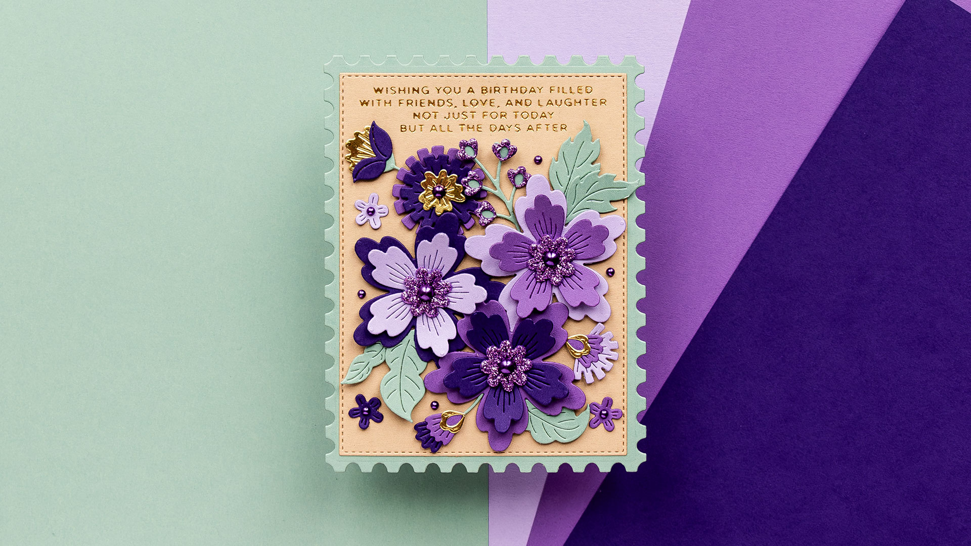
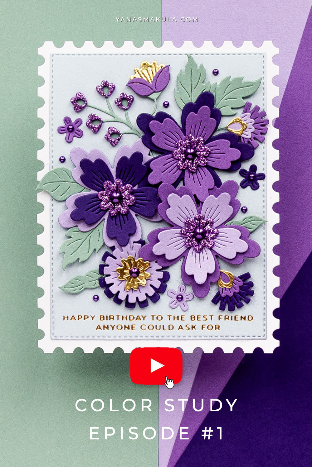
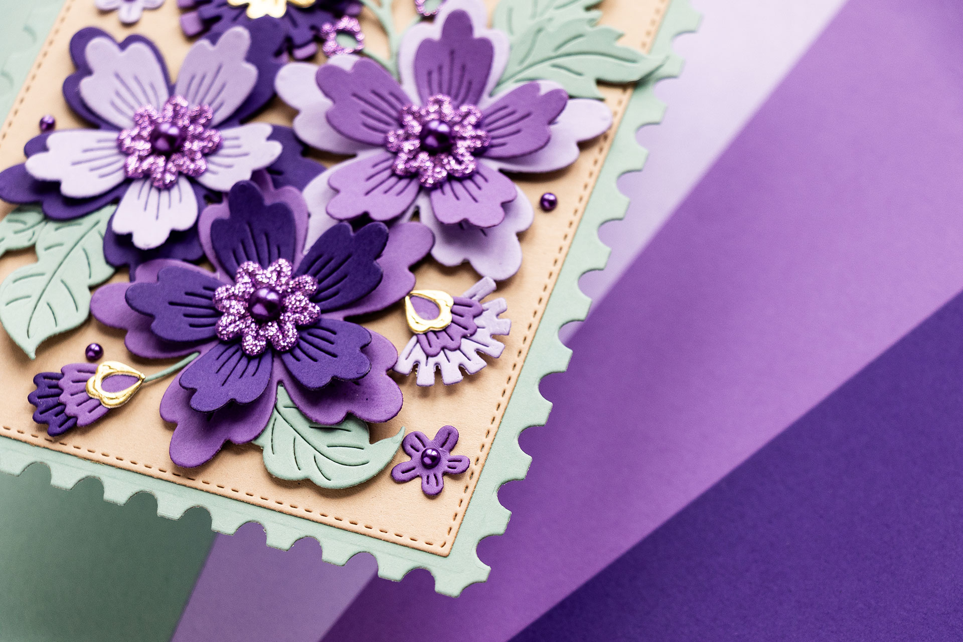
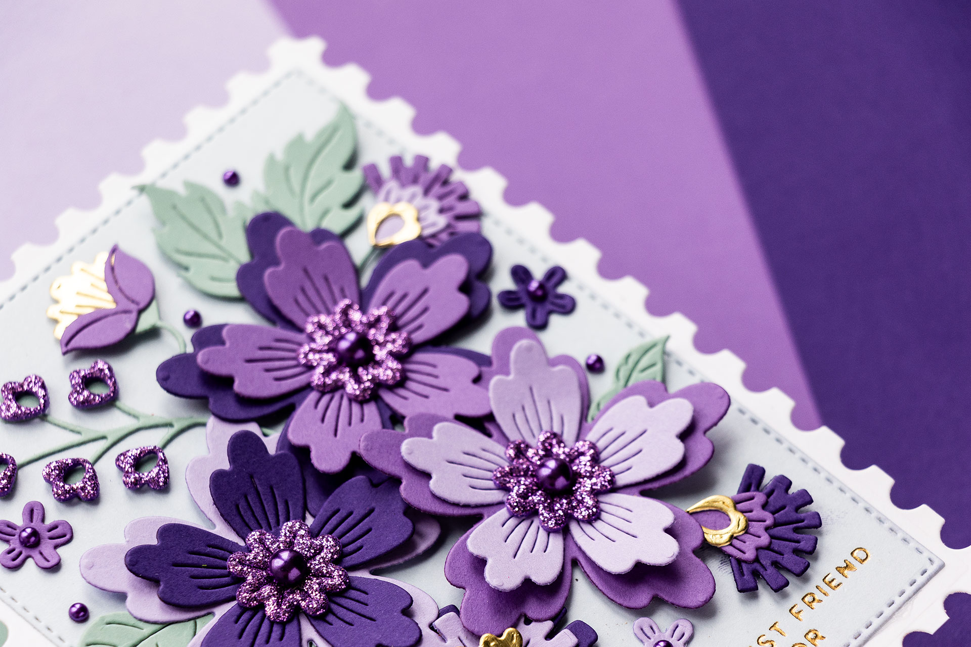
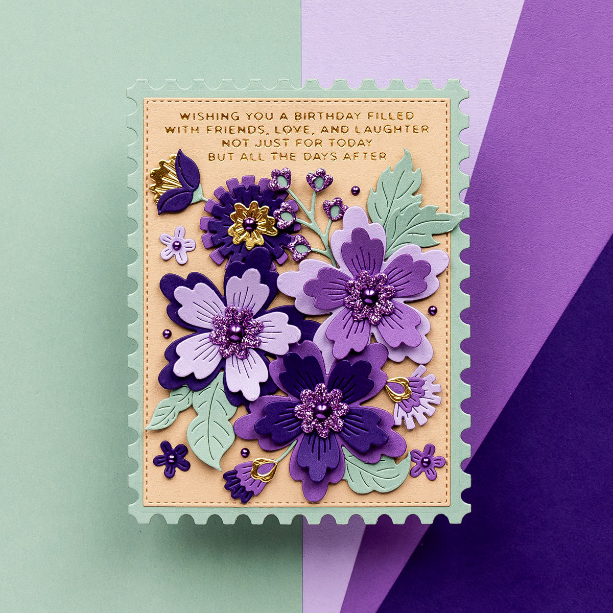
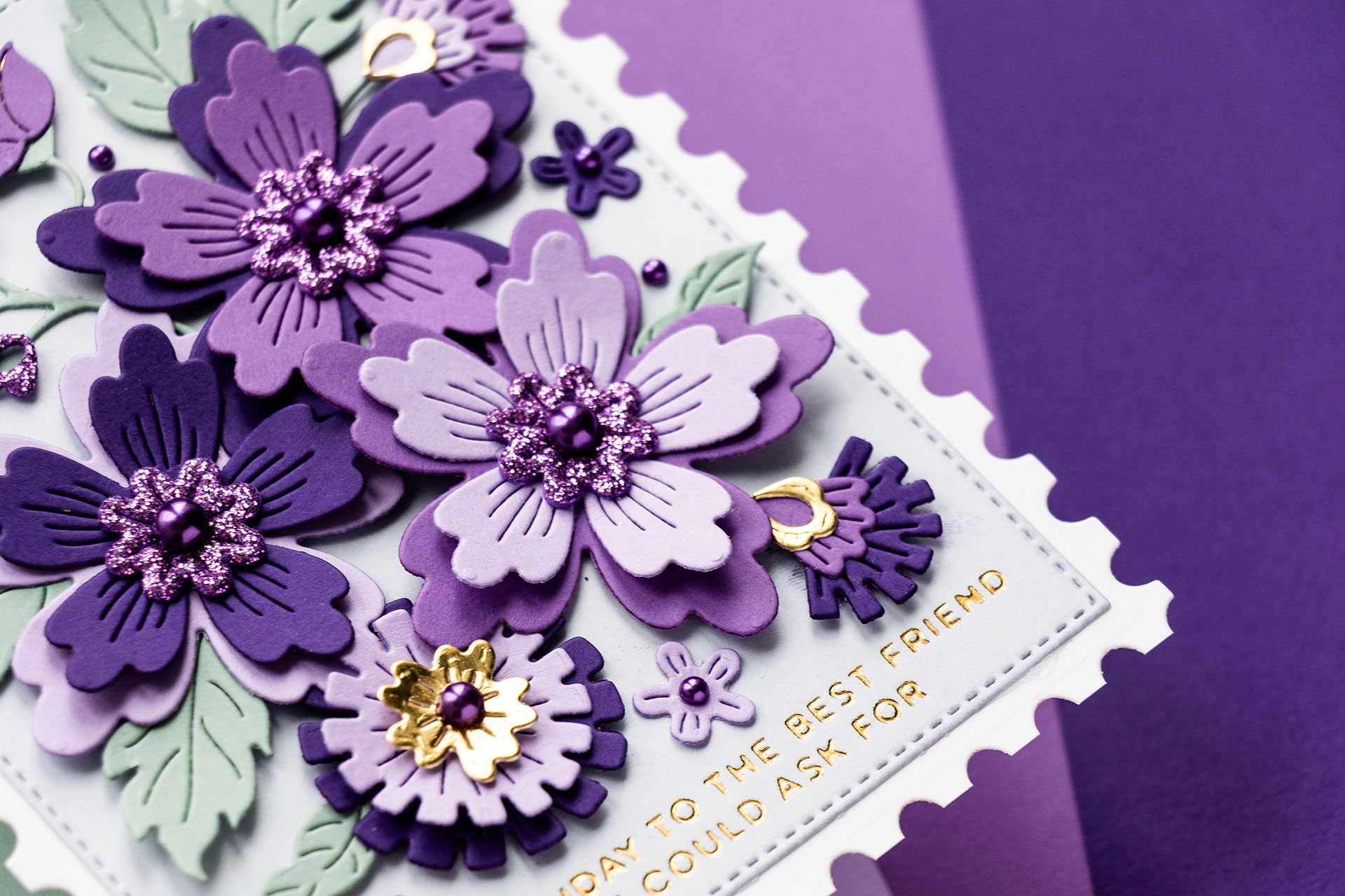
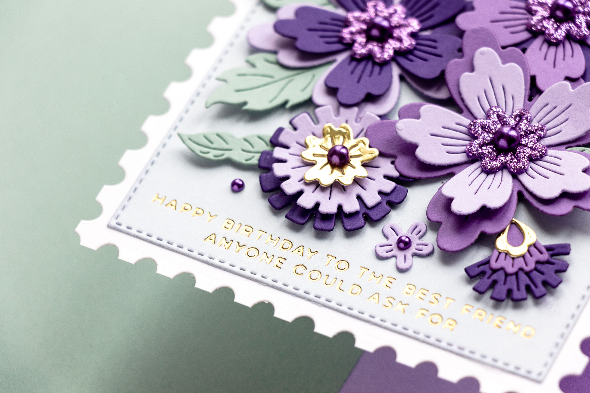
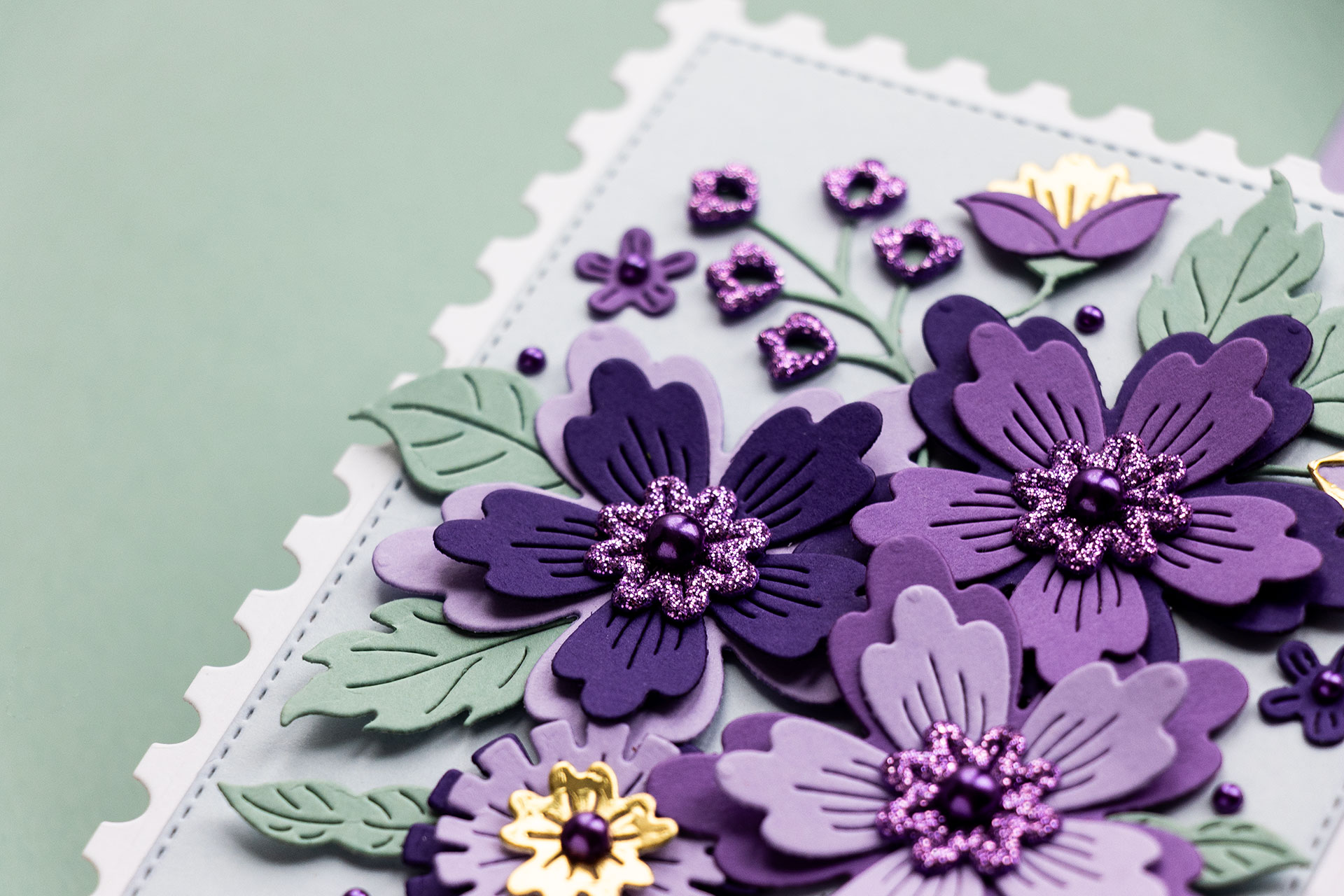
The color combination I’m exploring today is complementary, meaning I have 2 colors on the color wheel that sit opposite each other. The colors are Green and Purple.
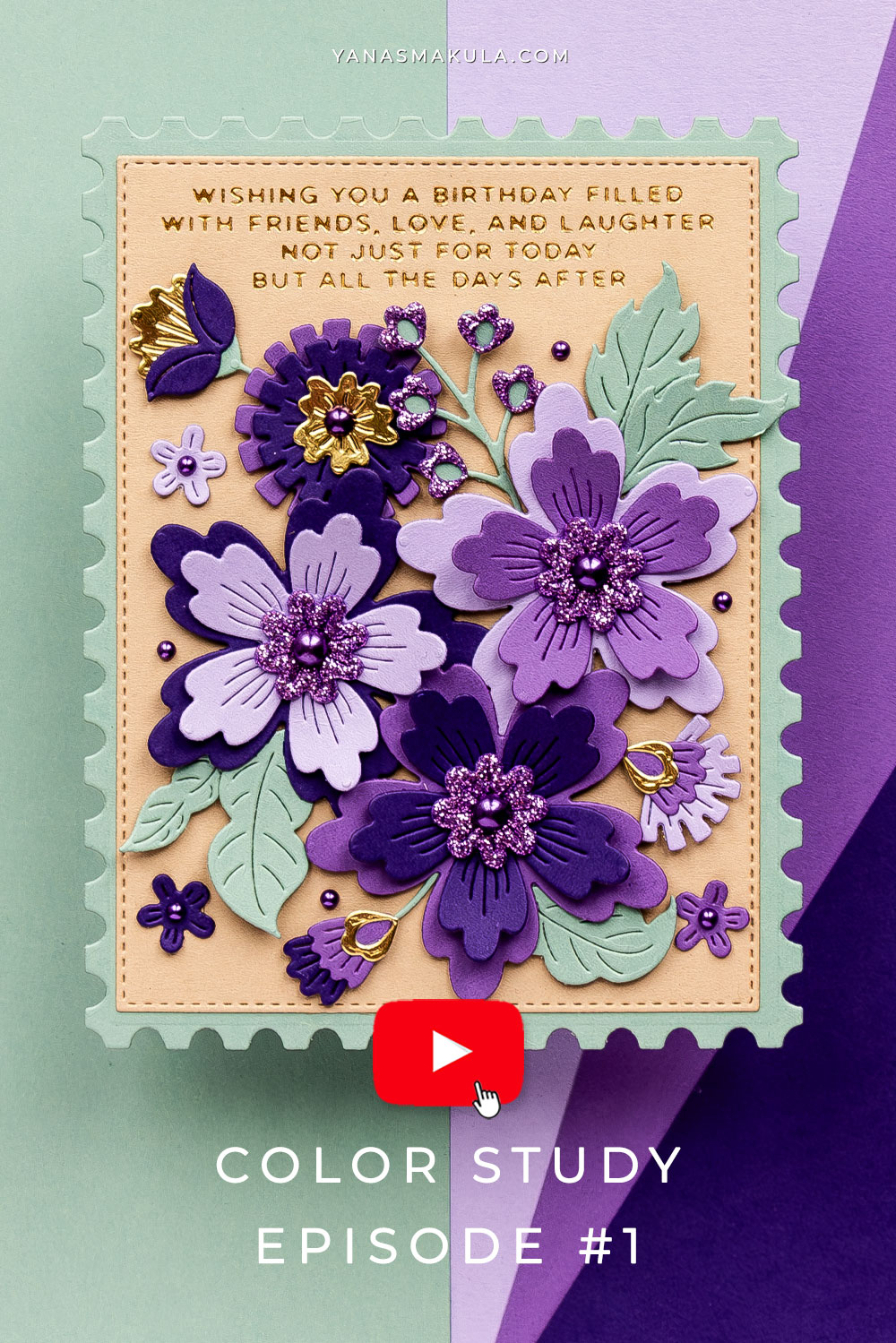
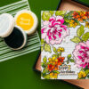
Instead of using the traditional shade of green, I am using muted green, like a breath of fresh air compared to the traditional greens I’ve been using for my cards. This is Sage from Spellbinders (discontinued, Simon Says Stamp has a similar shade of muted green – also called Sage).
The beauty of this color combo is exactly in that Sage color – it gives a sophisticated look to the finished card.
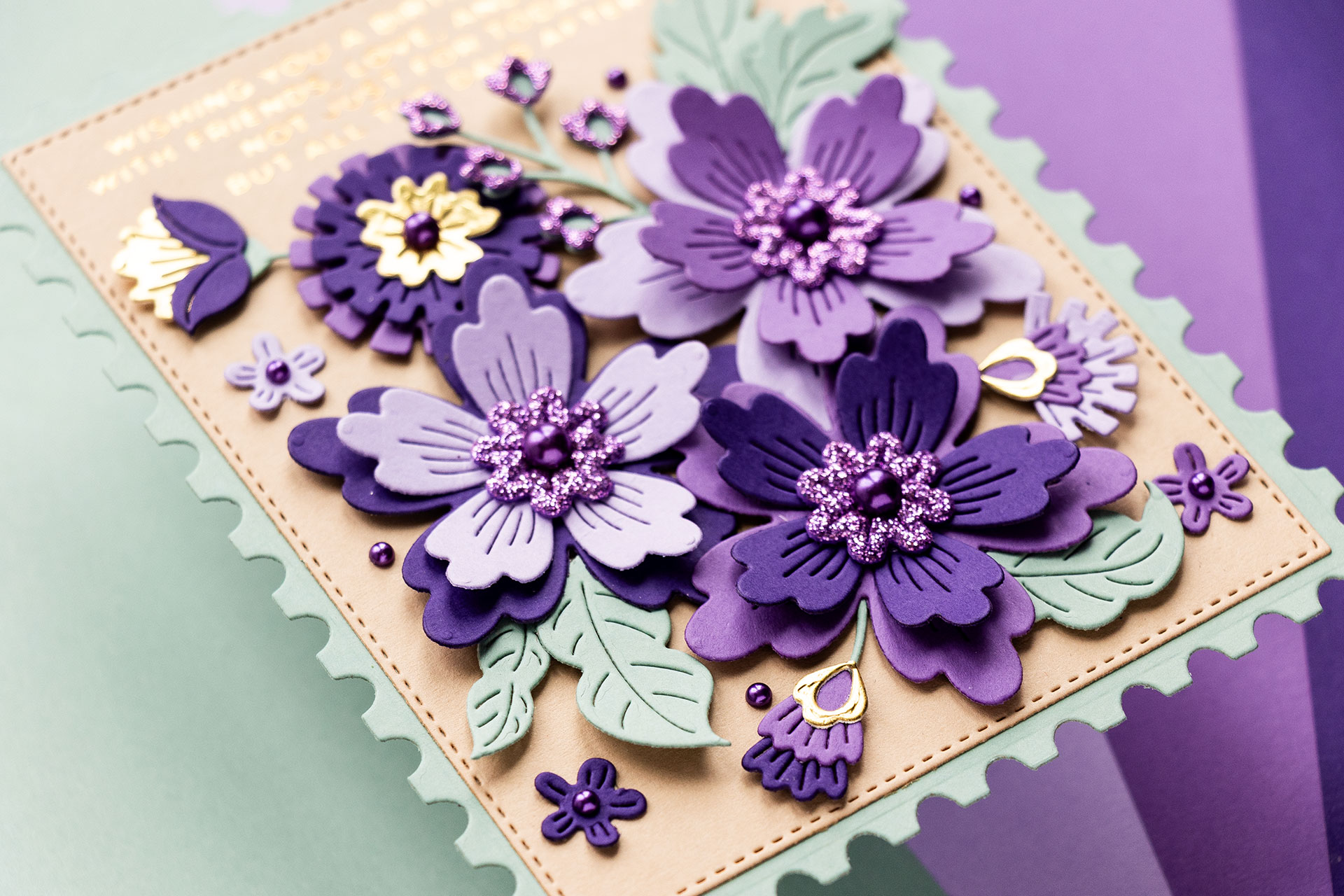
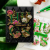
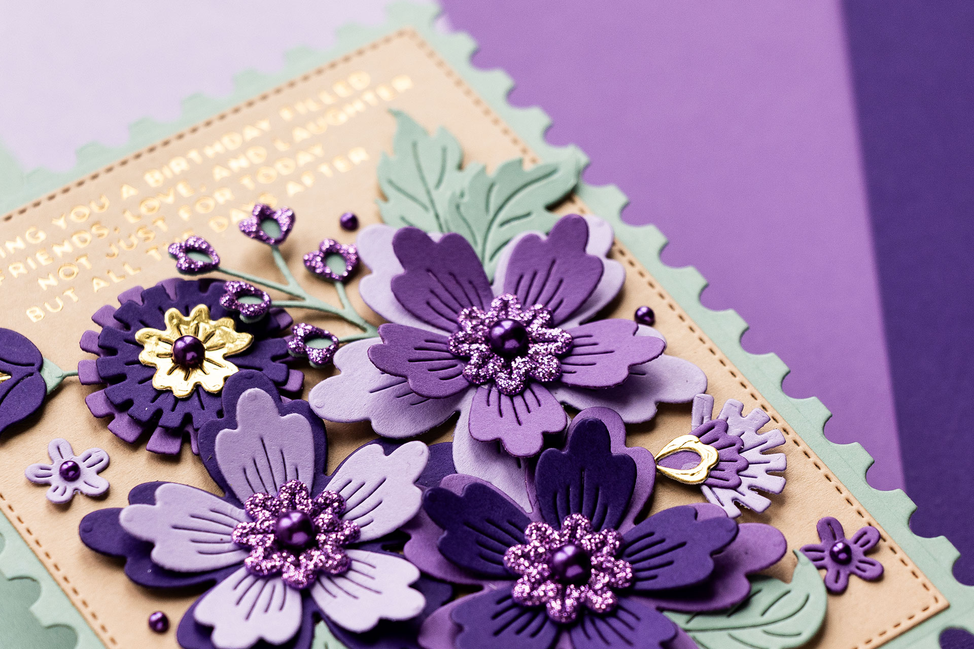
While I only have one shade for the green, Sage, I am using 3 shades for the purple. These are all Spellbinders colors: Purple Mist (discontinued), light purple (alternative – Fairy Tale), Lilac Blossom (discontinued), medium purple (alternative – Lavender), and Royal Amethyst (discontinued), dark purple (alternative – Lilac). This is my base color combination.
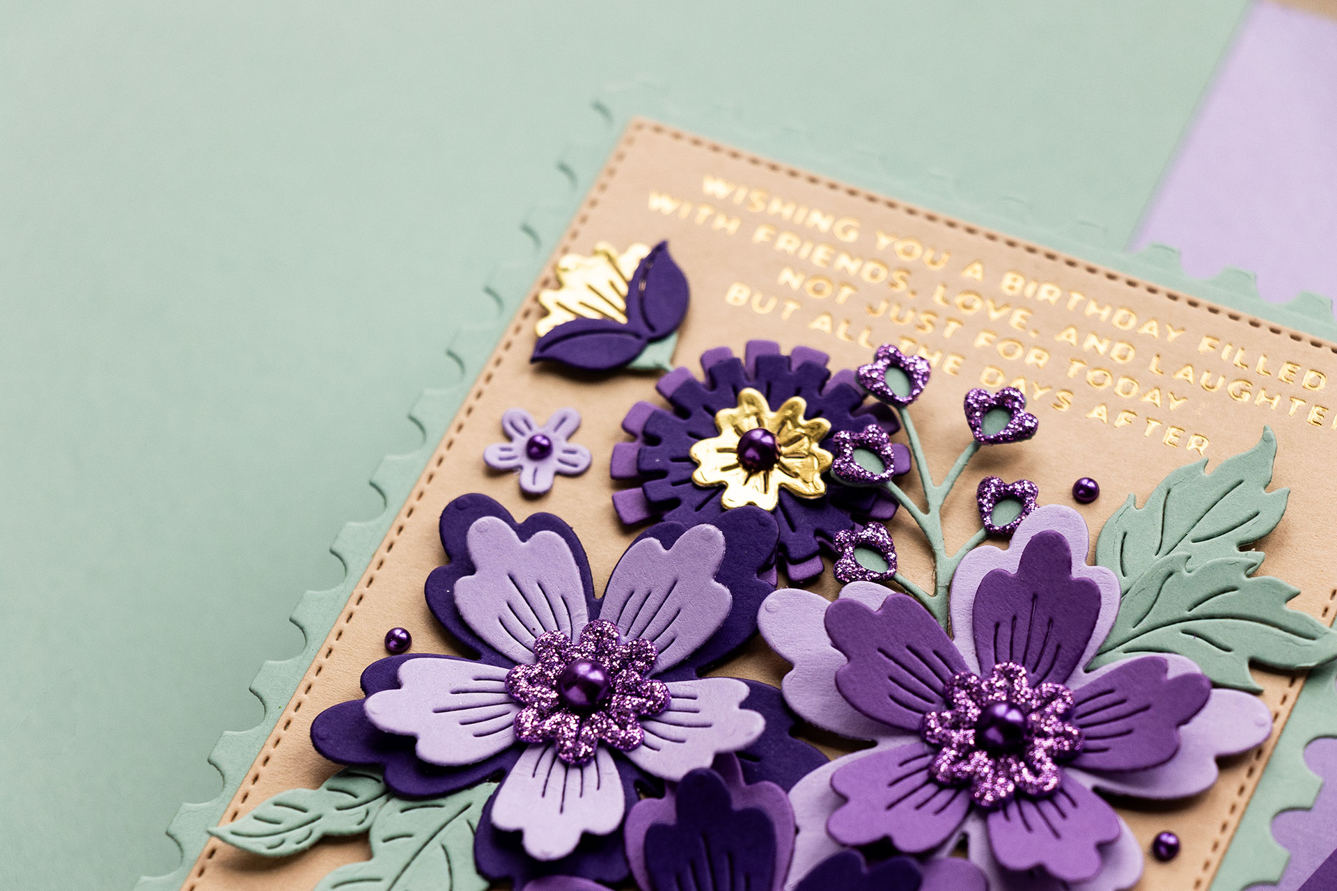
With any color combo, you can always bring in additional accent colors; those can be white, black, gold, silver, and other colors, too. I brought in gold – using mirror gold cardstock to create little accents on some of my die cuts and kraft, which, in a way, is a form of gold, just plain without shine or shimmer. The Kraft one is Dune cardstock from Spellbinders (discontinued); the alternative is Fawn.
I also brought in pale blue for another card, Glacier from Spellbinders (discontinued; alternative is Windy), to experiment with this color combination a bit further.
So, my main color combo is Muted Green and Purple with a touch of gold. A variation of that is Muted Green and Purple with a touch of gold and Pale Blue.
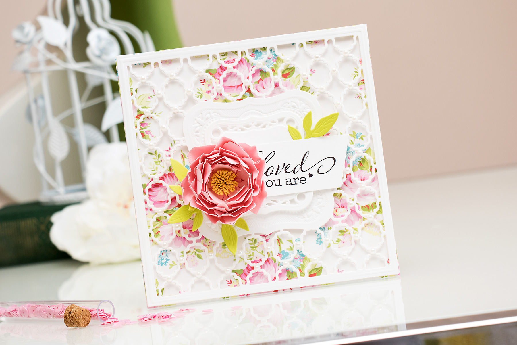
When working with a limited color palette, such as the Muted Green and Purple, you can add interest by using textures. The dies I used today, the Floral Spray from the Bayfair collection with Spellbinders, not only cut the flower shapes out but also added cut marks, creating texture on the paper. Another way to add texture without deviating from the color combination is by using glitter paper in the same color. I incorporated small flower details that were cut from the Glitter Foam, and glitter paper works just as well. You can also use colored cardstock with different finishes – metallic papers, or texture papers will add interest here.
Okay, now that we’ve talked about this color combination, let’s go ahead and try it out. I’m creating cards with the Floral Spray from the Bayfair collections with Spellbinders. These florals are stunning and, in a way, remind me of the Club Blooms die set (discontinued). If you don’t have these dies but want to give this idea a try, see what florals you have in your stash and use those.
I die-cut the parts and pieces from the colored cardstock and glitter foam from Spellbinders and assembled my flowers. These aren’t hard to put together, although you might be a bit confused at first. Use the die packaging as an example, and you’ll be fine. There’s also an example on the Spellbinders website, so you can go there as well.
With the flowers assembled, I planned my cards. I wanted the flowers to take center stage, and I didn’t want anything to distract from them, so that meant keeping my sentiment small and away from the center. I used glimmer plates from my inside card sentiments glimmer plate set with Spellbinders (discontinued) and foiled sentiments in gold foil at the bottom of the blue panel and at the top of the kraft panel.
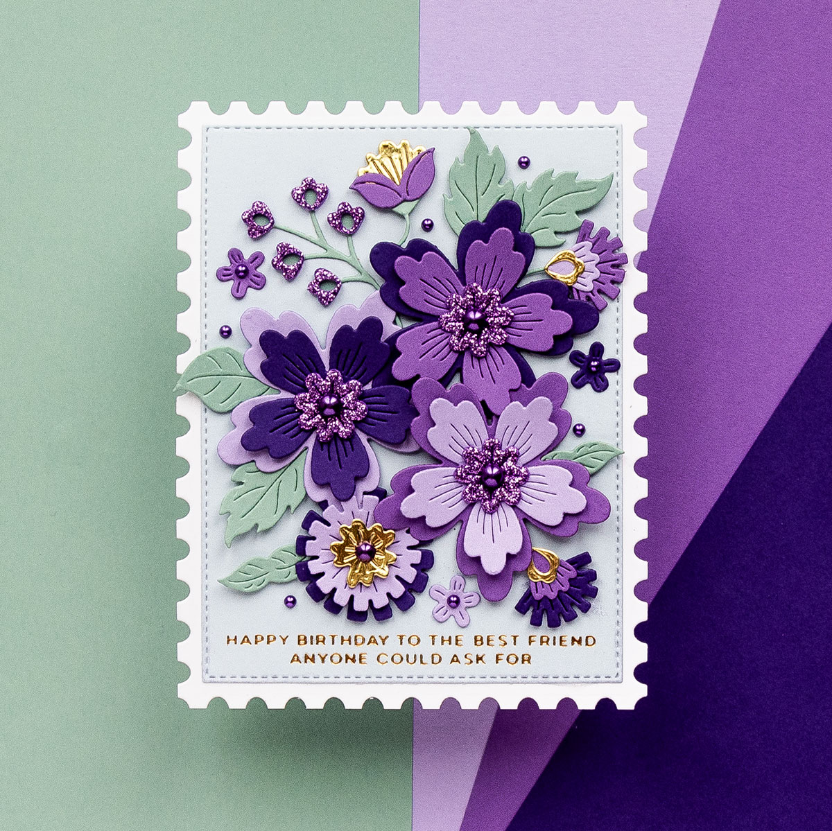
I also used the Nested Postage Labels & Tag dies from the Bayfair collection to die-cut background shapes for my card
With the flowers adhered to the label shape, I adhered that to a postage shape and added a trimmed A2 card base from the back. I also added embellishments – I used Fashion Lilac dots (discontinued) and added these as flower centers and little dots scattered on my card.
So this concludes my color study #1. I love this color combination, and I hope to come back to it often. I hope you’ll give it a try as well.
SUPPLIES
I’m listing the products I used below. Click on the link to go directly to the product. Where available, I use compensated affiliate links, which means if you make a purchase, I receive a small commission at no extra cost to you. Thank you so much for your support!
 Spellbinders Floral Spray Etched Dies Shop at: SB USA | SB UK |
 Spellbinders Nested Postage Labels & Tag Etched Dies Shop at: SB USA | SB UK |
 Simon Says Stamp Cardstock 100lb Sage Shop at: SSS |
 Spellbinders Lilac ColorWheel Cardstock Shop at: SB USA | SB UK | |
 Spellbinders Lavender ColorWheel Cardstock Shop at: SB USA | SB UK | |
 Spellbinders Fairy Tale ColorWheel Cardstock Shop at: SB USA | SB UK | |
 Spellbinders Windy ColorWheel Cardstock Shop at: SSS | SB USA | SB UK | |
 Spellbinders Fawn ColorWheel Cardstock Shop at: SB USA | SB UK | |
 Spellbinders Mirror Gold Cardstock Shop at: SB USA | SB UK | |
") Spellbinders Glimmer Hot Foil System (Platinum) Shop at: SSS | SB USA | SB UK | AMZ | |
 Spellbinders Platinum 6 Machine With Universal Plate System Shop at: SSS | SB USA | SB UK | AMZ | |
 Spellbinders Tool ‘n One – White Shop at: SSS | SB USA | SB UK | AMZ | |
 Bearly Art Mini Precision Craft Glue Shop at: SSS | SB USA | AMZ |
 Glassboard Studio Super Strong Magnets Shop at: GBS |
 Glassboard Studio Glass Craft Mat – Code YANA15 Shop at: GBS |
 Foam Double Sided Strips Shop at: SSS | AMZ |

Wow, gorgeous cards! The designs are stunning!
thank you, Stacey! i’m glad you like them 🙂 I enjoyed creating with this new Sage color, it is so beautiful.
I love this color study idea! Bringing in the Dune and Glacier were great ideas. It set off the purple and brought out the depth of the green. I hope you do more!
Really Beautiful cards!!! Love the color combo!!!
I so appreciate your explanation of color theory. I just ordered a color wheel, but have considered it for some time. Thank you, Yana!
Wonderful color combo….YES, please do more color combos!!!
Paper Hugs,
Jan
Yana, gorgeous cards as always, and purple is one of my favourite colours. During Weekender I told you my grandfather and great-grandparents on both sides were from the Ukraine and you asked from where, well I asked my mum. Apparently some of them were from Yablano. (sp) but we’ve never been able to find it on a map and on my maternal grandmother’s side she didn’t know where they came from which was strange. They settled in Canada in what was Port Arthur at the time (now Thunder Bay) in a Ukranian community. I wish I knew a lot more
What a great idea! I too struggle with color and color combinations so I appreciate this video and would definitely appreciate any other videos you do on this topic! The sage color really allows the purples to be the star of the show on your cards! BTW, some years ago I got turned on to coloring with pencils from watching your videos, gave it a try and since then have spent many hours happily playing with some colored pencils. Last year for Christmas Santa brought me a full set of Polychromos!! I’ve been a happy camper ever since!!!!! I’d like to experiment with die cutting from colored pencil paper and using pencils to color die cuts but haven’t done that yet. I can’t thank you enough, Yana, for introducing me to something that has given me hours of pleasure and really helps with my anxiety. Thank you for the video and for sharing your adventure into color combinations!
Beautiful card, would love color study series by you, Yana, that would be outstanding!
These are so so pretty . love this idea of colour study!
Thank you, thank you Yana for your color study video‼️‼️
And YES I hope you can find the time to do more. I use the color wheel and other tools to help me but color combinations are still my biggest challenge.
Just last week I couldn’t decide which color to use with purple, yes believe it or not. I didn’t realize green was the complimentary color because looking at the color wheel, green is opposite of Red-Violet which confused me. Your video WAS A HUGE HELP and your cards are gorgeous! Btw, Glacier almost looks like a tint of Sage, either way, I loved your combinations. Thx again!