


Hello crafty friends! This is Yana Smakula, and welcome back to my blog. Today I’m joining Simon Says Stamp for their Always There Release blog hop, and I’m sharing not one, but two cards featuring the Floral Word Builder stamp set and coordinating dies.
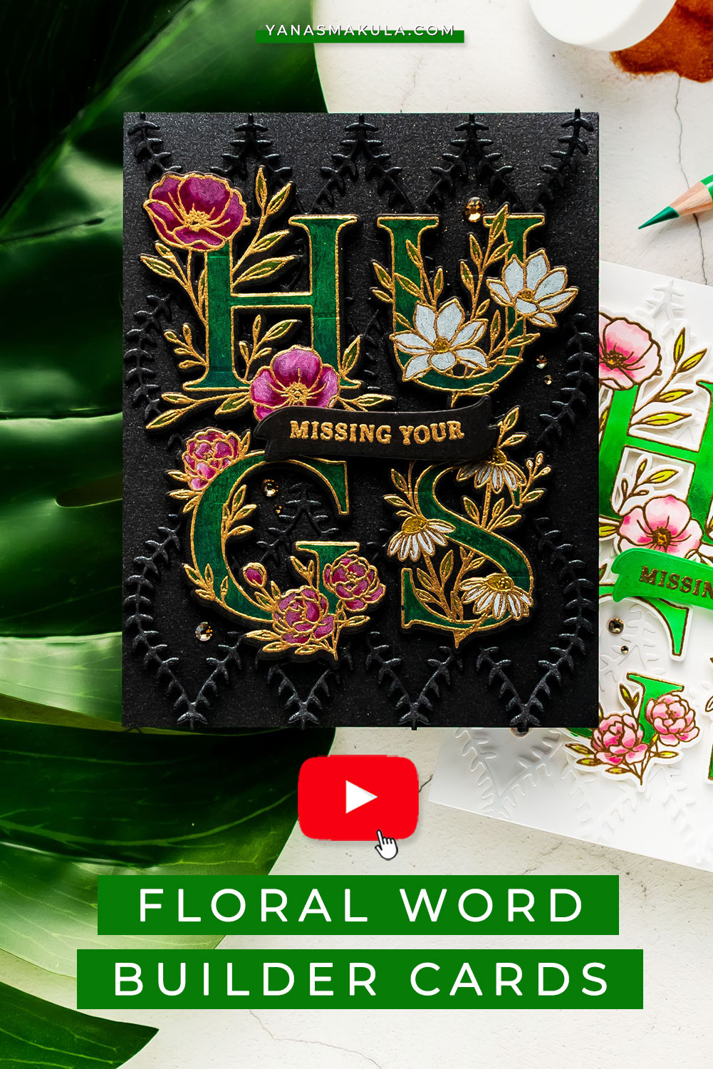
Like this project? Pin it and save for later
VIDEO TUTORIAL
Watch the video below or on my YouTube channel.
Like this video? Please give it a big thumbs up and share it with a crafty friend! Leave me a comment, too. I always love hearing from you.
CARD DETAILS
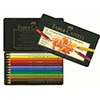
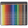
It has been quite some time since I last used my Polychromos colored pencils from Faber-Castell, and I honestly forgot just how much I enjoy coloring with these pencils, especially on dark cardstock. Colors just pop beautifully on a dark background, and you guys know how much I love dark and dramatic cards.
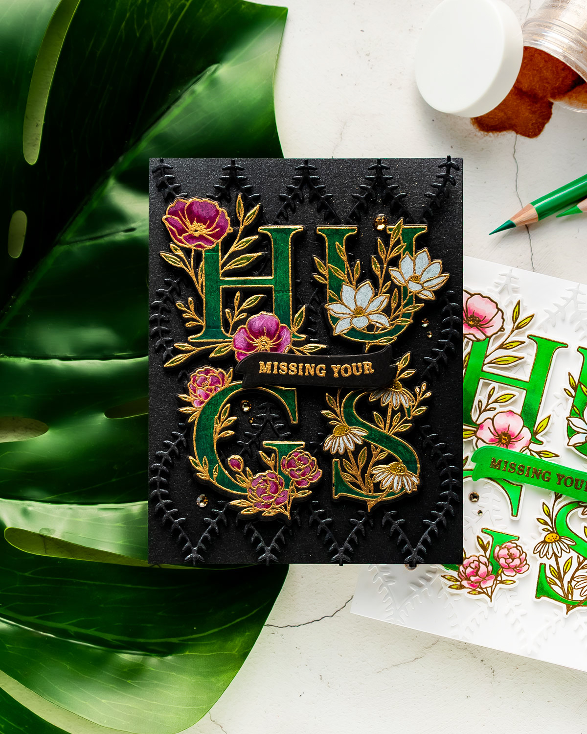
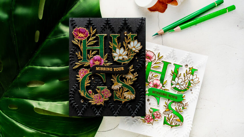
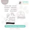
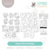
For my first card, I decided to use black cardstock together with gold heat embossing and simple colored pencil coloring. The Floral Word Builder stamp set is a fabulous, large 6×8 set featuring individual letters that can be combined to create words like hello, hugs, love, joy, and you. There’s also a coordinating Floral Builder Sentiments set that pairs beautifully with the main set and includes additional sentiments and a small banner image.
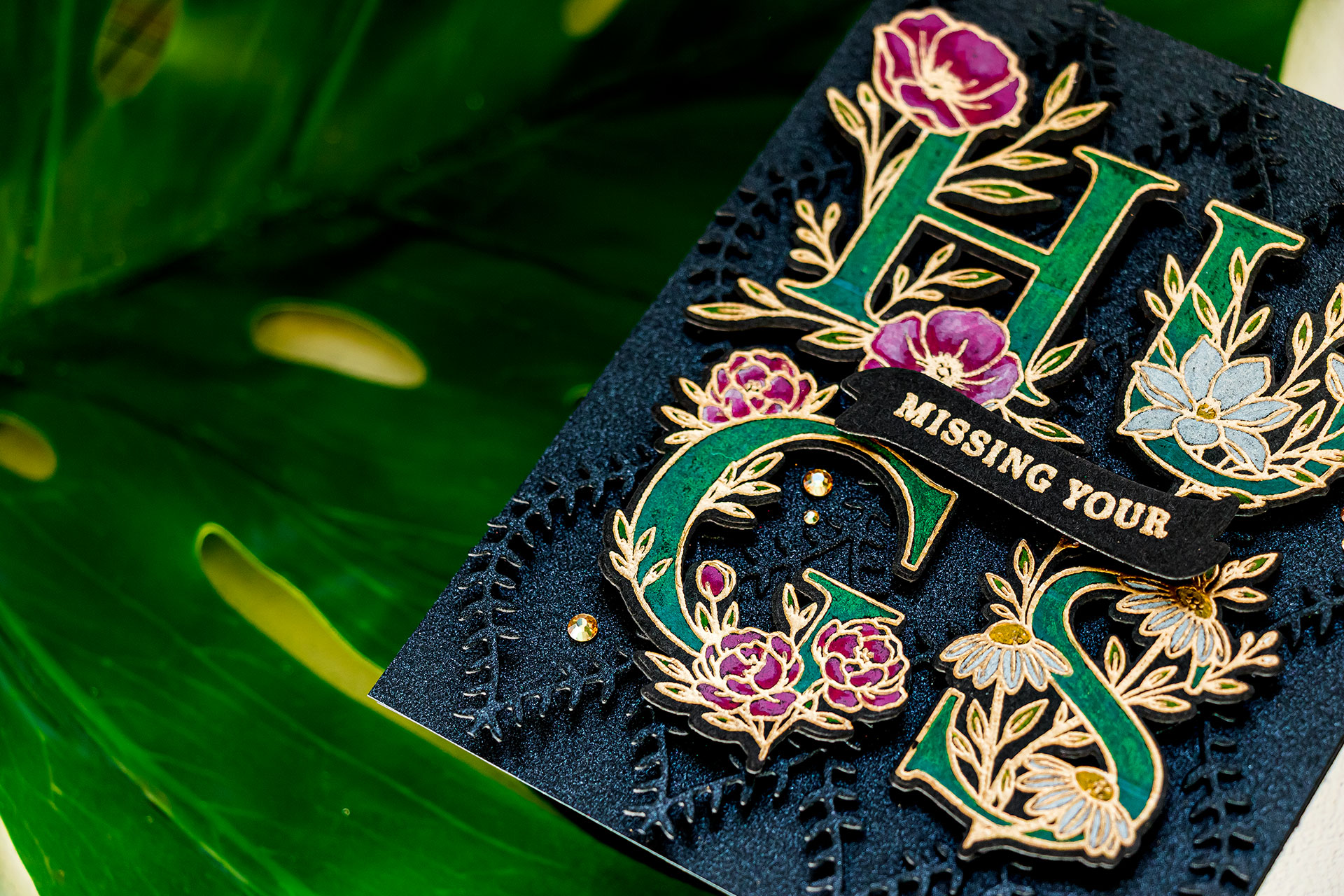
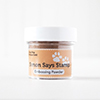
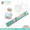
I started working on my card by trimming Spellbinders black cardstock to 4 ¼ x 5 ½ inches and prepping it with an anti-static powder tool. I used my MISTI Stamping Platform to stamp the letters for the word “HUGS” in clear embossing ink and heat embossed them in Antique Gold embossing powder from Simon Says Stamp. This is by far one of my favorite gold embossing powders; it has such a rich and luxurious finish.
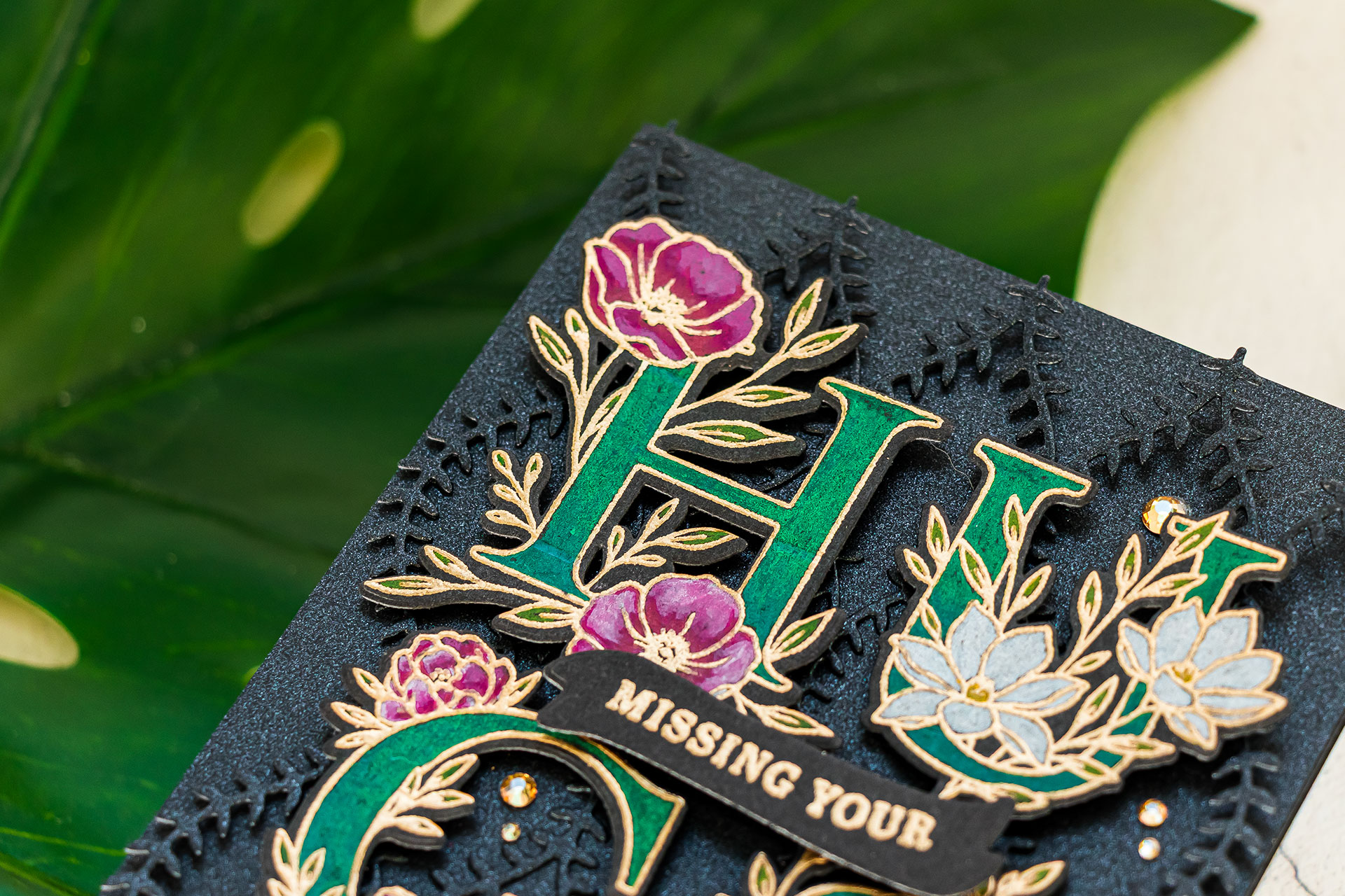
I heat embossed two letters at a time and then used the coordinating dies to cut everything out. While I already had my stamps mounted in the MISTI, I also stamped and heat embossed the same letters onto white cardstock for a second card.
Once the heat embossing was complete, I used an eraser to remove any leftover powder residue from the cardstock. This helps clean up the background and keeps the black cardstock looking nice and crisp.
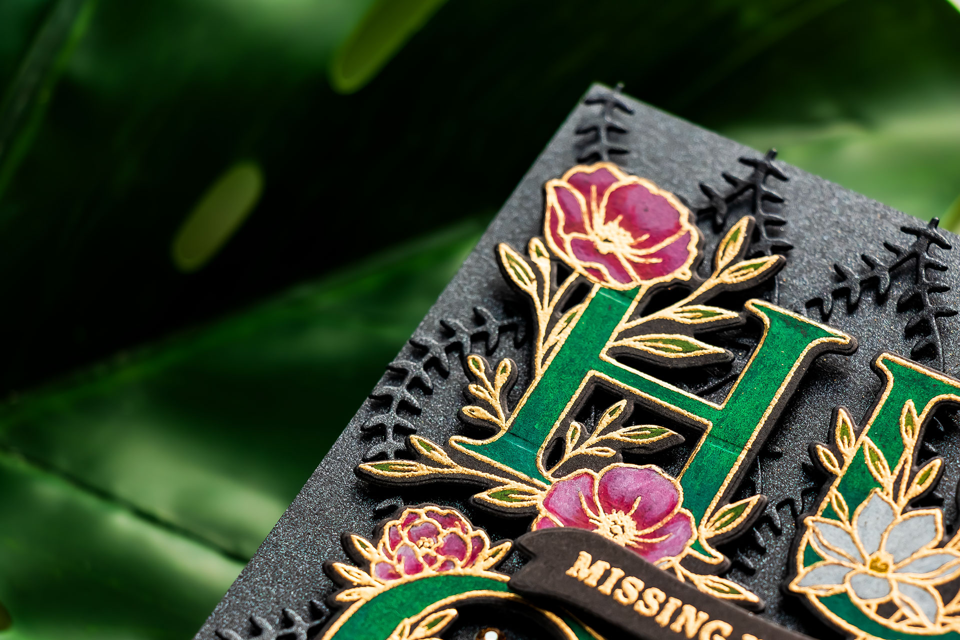
Next came the coloring. I used my Polychromos colored pencils to color the floral letters. For the greens, I used Dark Phthalo Green and Emerald Green to create a rich emerald look. I originally planned to only color the letters themselves, but once I started coloring, I decided to add color to the flowers and leaves too.
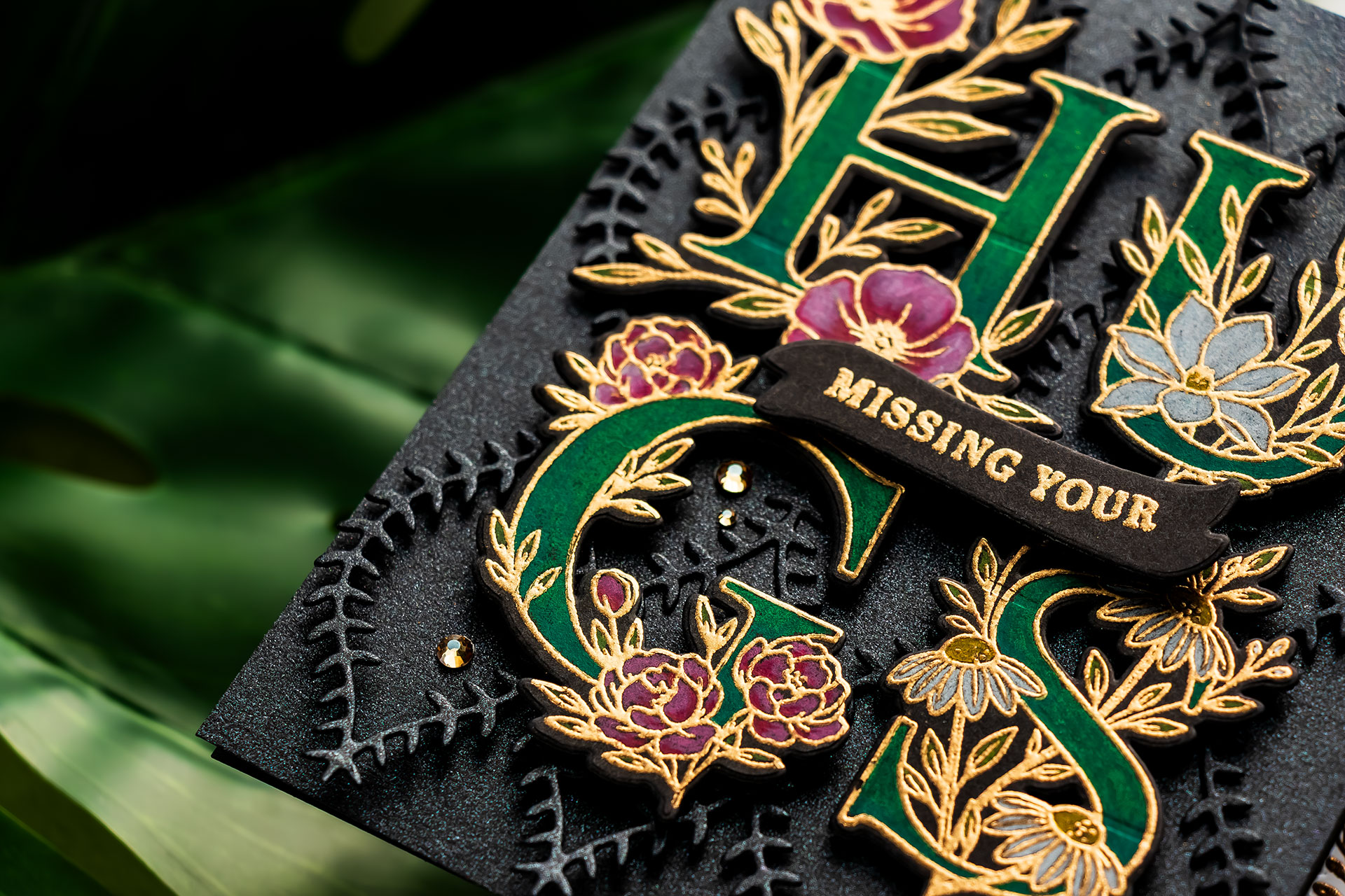
For the pink flowers, I used Pink Madder Lake, Fuchsia, and Pink Carmine along with a touch of white pencil for blending and highlights. The leaves were colored using May Green, and I also added small touches of yellow to some of the florals using Dark Cadmium Yellow.
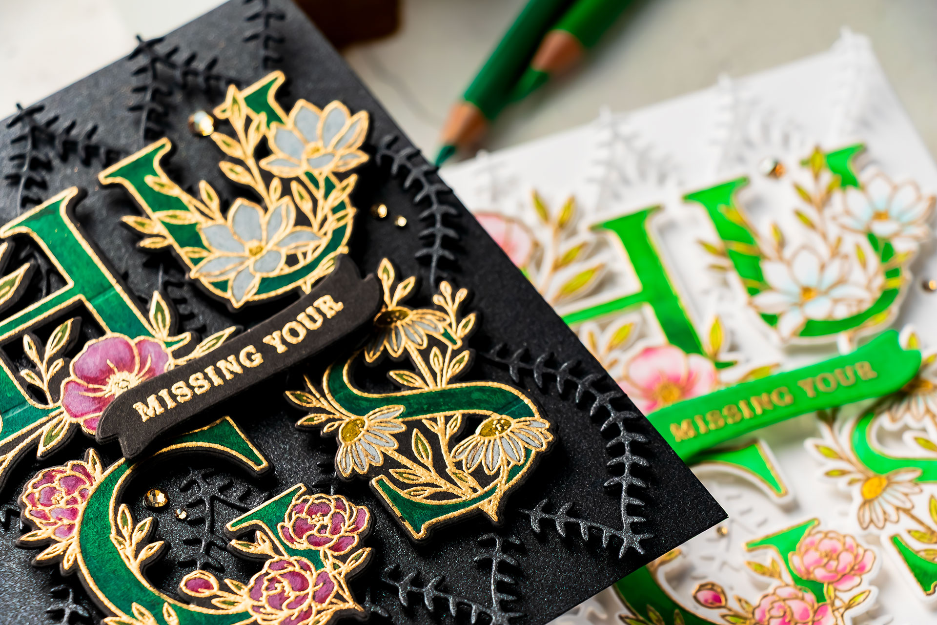
Because the floral images are fairly small, there isn’t a lot of room for blending, but I was still able to add simple shading and dimension with just a few colors.
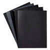
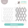
To create additional texture for the background, I die cut the Willow Weave background from brushed black cardstock from Spellbinders. This cardstock has a subtle shimmer and adds beautiful texture and dimension without distracting from the focal point.
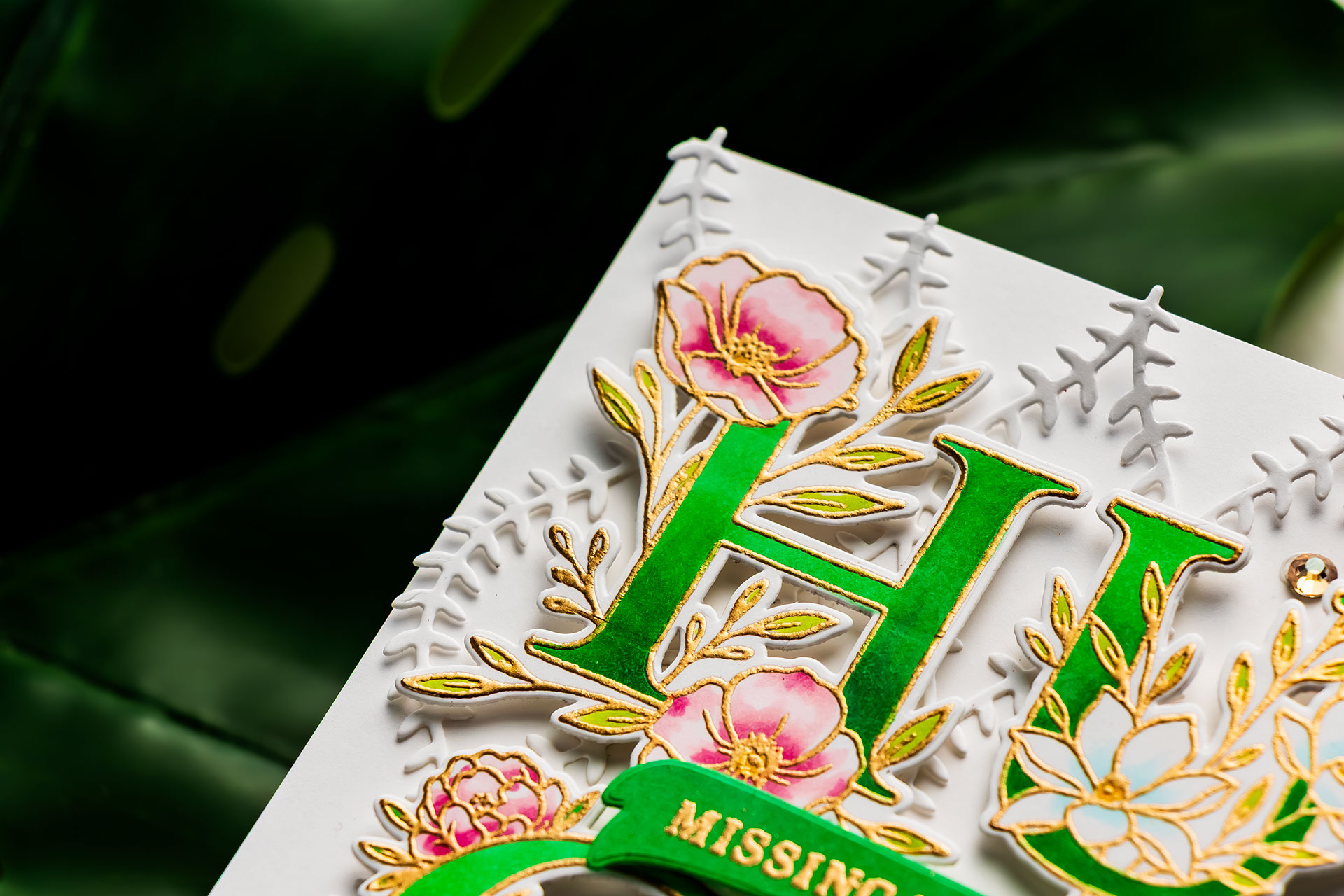
I layered the die-cut background over my black panel, but intentionally did not glue it down completely. Instead, I allowed it to stay slightly lifted from the background and only secured it in place behind the letters using black foam adhesive squares. I really love the airy and dimensional look this created.
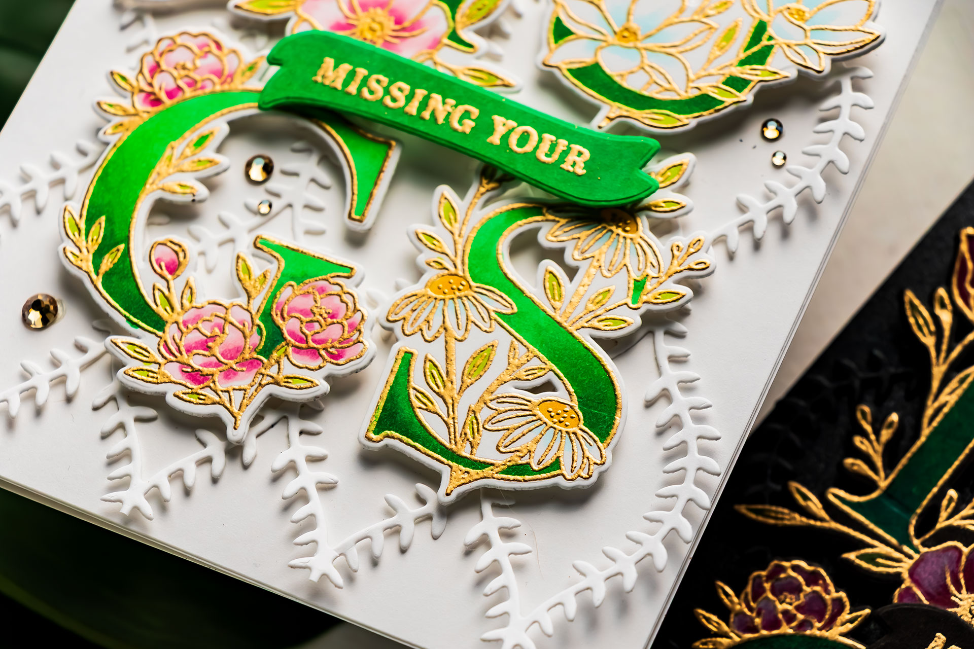
For the sentiment, I stamped and heat embossed “missing your” from the Floral Builder Sentiments stamp set onto a small banner and foam-mounted it between the two rows of letters to create the sentiment “missing your hugs”.
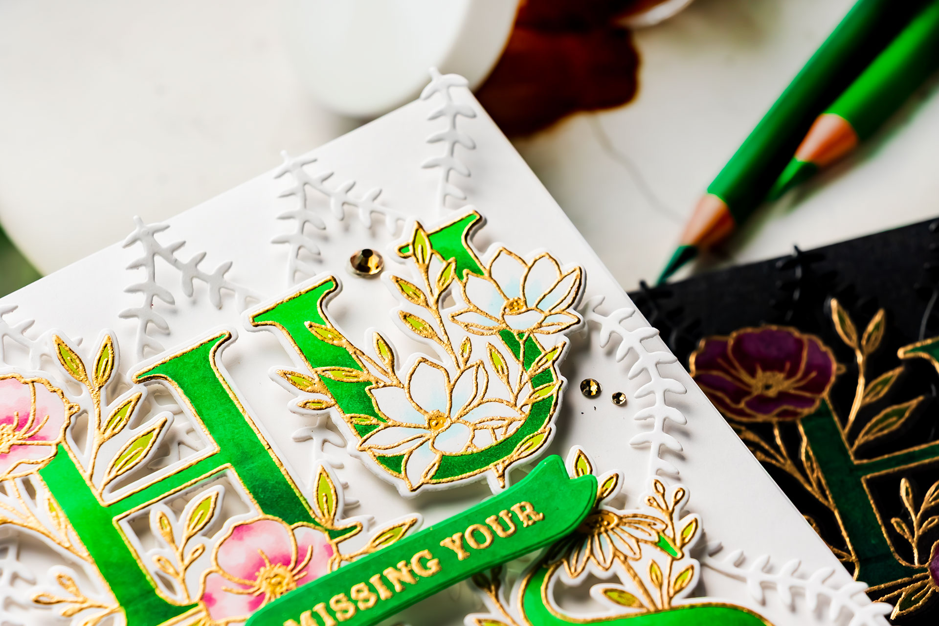
Lastly, I embellished the card using Gold Mix gems from Spellbinders and mounted the finished panel onto a black A2 top-folding card base. I also added a white panel to the inside of the card for writing a message.
For my second card, I used the exact same design and layout but changed the look completely by using white cardstock and Copic markers instead of colored pencils. I tried to mimic the same color palette and absolutely love how different these two cards feel despite using the same products and composition.
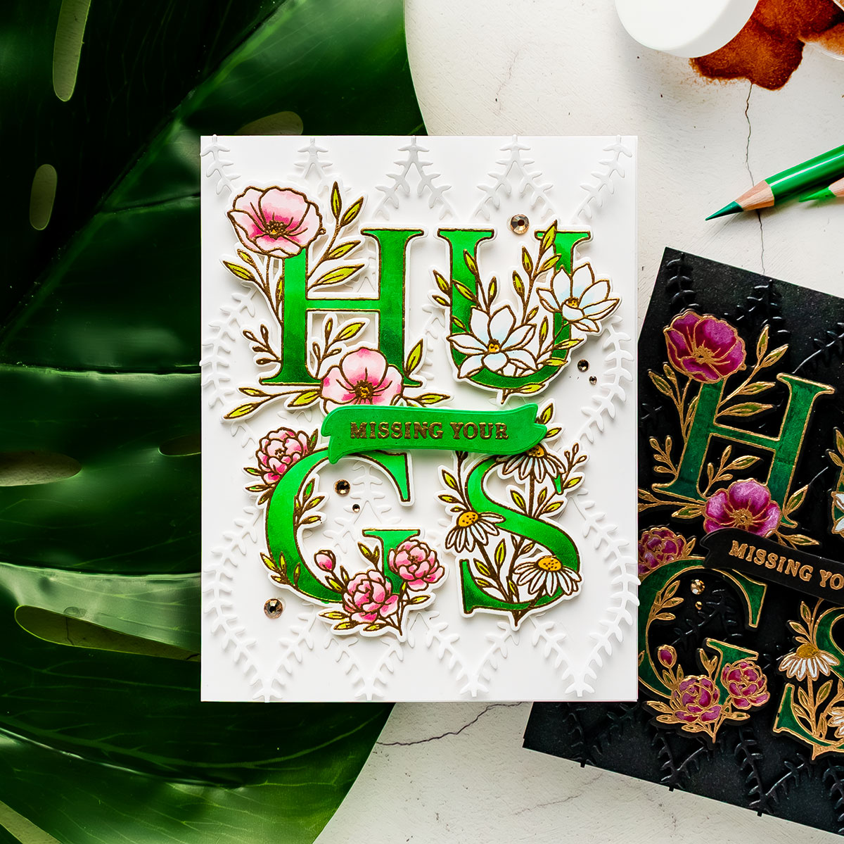
The black card feels dramatic and elegant, while the white version feels fresh, bright, and cheerful.
Which one is your favorite? The black or the white? I’d love to hear from you in the comments below!
BLOG HOP
Be sure to visit all of the stops on the Simon Says Stamp blog hop for more inspiration using the latest release products. There are also giveaways along the way, so don’t forget to leave comments for your chance to win. If you arrived from amazing Barb Engler, the most talented Heejung Hunsberger is the next person on the list.
SUPPLIES
I’m listing the products I used below. Click on the link to go directly to the product. Where available, I use compensated affiliate links, which means if you make a purchase, I receive a small commission at no extra cost to you. Thank you so much for your support!

Both are STUNNING but the black is soooo unique! I LOVE the HUGS, it’s soooo elegant!
those are both exceptionally striking. The black grabbed me first, but the white one is not to be over looked. Very beautiful!
Wow, your cards are gorgeous. I especially love the one with the black cardstock. It’s been so long since I have made a card using black cardstock. Thank you for inspiring me today.
Thank you for showing both black and white versions. I was instantly drawn to the black and love the slight shimmer that makes the “hugs” really pop.
I love your dark background cards. I really enjoy your channel and all you do for Spellbinders. See you for the Weekender.
Wonderful heat embossing.
Your cards are stunning! You do amazing floral cards!
Wow! Your cards are amazing!
Oh my goodness Yana, your cards are absolutely STUNNING !!! The White version is beautiful but that Black version is nothing short of dramatic, I’m totally smitten with it. I didn’t even take time to watch your video, I wanted to make my comment first but now I’m off to watch you create your cards. WOW, that black card blows me away, Thank You so much for sharing both your cards and your creating process, I know even before watching the video that it will be wonderful as watching you create these beauties.
Yana both your cards are gorgeous. The one with the black background is beyond stunning. I am in awe of your creations. Thanks so much for inspiring us with your beautiful creations.
I am always in awe of your dark, dramatic colors! Beautiful cards!
Not sure which card I like better. They are both very eye catching and beautiful. You never disappoint.
When I saw your cards that Heidi was showing on release day, I was blown away with your use of black as a background. It’s so dramatic and stunning!! Love love LOVE it!!!
Gorgeous cards with these beautiful designs! Both look fabulous, but the white one really catches my eye!
You’ve inspired me to use my colored pencils. You’re cards are stunning!
These are beautiful but the dark card is absolutely stunning!!
OMG! Your cards are stunning, especially the black card! It is so elegant and different. Totally love it!
Both are stunning, but the black really caught my eye!
Hi, Yana –
I think I prefer the black but it is a difficult choice. Love colored pencils and you have made this Word Builder set tough to resist! Your work is that of a master!
Lori S in PA
WOW, I love both cards. The black is very dramatic, and makes the colors pop off of the card. The white is very pretty, too, but so different. I like them both…
Cards are stunning; the black background card is outstanding!
These are both stunning! I am all in for that black background that just makes those letters pop!
Both cards are really beautiful and elegant
I learned so much in your tutorial today and am super happy! I have wondered how to get that white powder off my black cardstock and now I know. I will be grabbing that eraser! Also, the polychromos pencils on black. Wow! Your cards look modern and stylish!
I love that card. It’s so elegant!
YOWZA! These are absolutely stunning! The gold embossing makes everything pop so perfectly! Gorgeous!
Such beauties, Yana! Love both cards so much!
I really love using the willowweave in black on black! So elegant!
Wow, your coloring just glows!! So so pretty Yana.
Oh wow these are gorgeous
Love the black card!!
Both beautiful, but the black one is striking and stands out.
The black card is absolutely stunning!
Both are Gorgeous, but the gold and the coloring just POP on the black!!!
The dark background is so stunning! Love it!
Beautiful cards! I think the black is so dramatic and I love that!
WOW! The black card is so elegant! LoVe, LoVe, LoVe it!! Thanks for the video too.
The black card – Absolutely stunning! My, oh my!
Stunning cards! I’m loving the SSS floral letters! Great job!
Wow! Gorgeous cards. I love the black background.
LOVE the black as it is so dramatic. Thanks for sharing
Love both of your cards. Stunning!
Yana, your cards are stunning. love the black one!
Absolutely stunning! Love these 2 cards.
Both cards are exquisitely beautiful, but the black one really stands out to me. I especially love the suggestion of not gluing down the background texture more than what the design pieces adhere. It creates a stunning effect!
Gorgeous cards Yana. What a dramatic look with the black background! Great textures! Thank you for the inspiration!
Wow the letters really pop on the black background!
Gorgeous in black and white! I love the one in black most!
These cards are stunning with the dramatic coloring. I’m not familiar with using polychromos, but I love the effect, especially against the black cardstock.
Both cards are stunning. The black one is so dramatic