


Hello friends and welcome to Hero Arts Summer 2016 Release Blog Hop, thanks so much for joining us! This hop marks the launch of new catalog products in Hero Arts Store! New catalog is filled with amazing products you don’t want to miss, lots of which are must haves!
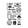
I’ve already shared a number of projects using new stamps and dies (and you can check them out by following this link) so for this post I decided to create masculine cards, Father’s Day card to be specific using Dapper Dad stamp set.
Like this project? Remember to pin it and save for later!
VIDEO TUTORIAL
The video I am sharing today is slightly different. While I do show how to make these masculine cards I also share a lot about my creative process and the difficulties during it. Its a fun video, a little longer than my usual videos, but I really wanted to share it and show you that cardmaking isn’t always super easy. Enjoy (and please do let me know what you think)!
Watch video below or on Youtube:
CARD DETAILS
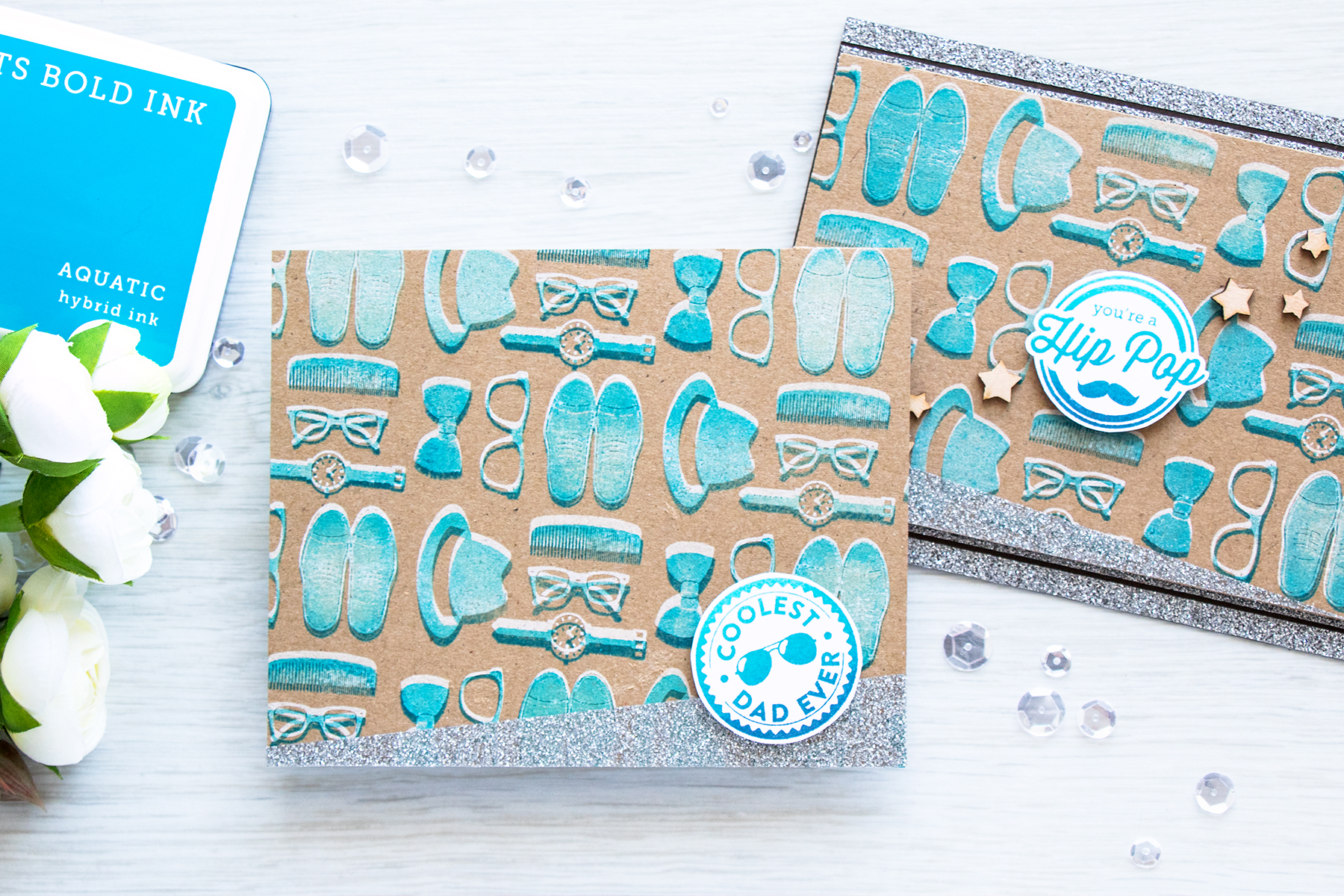
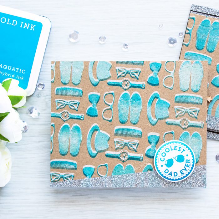
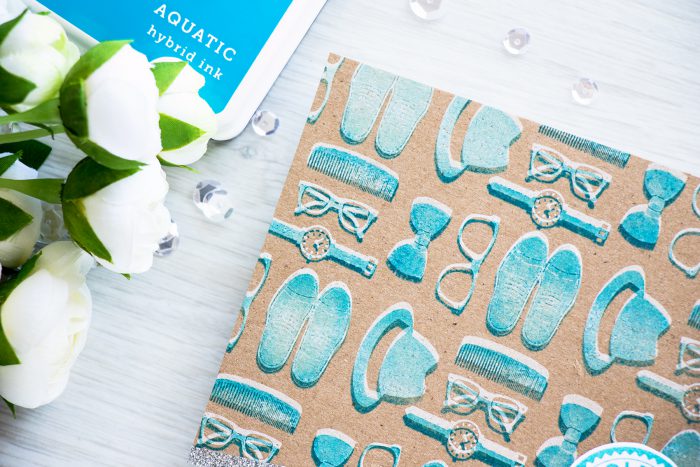
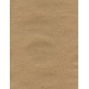
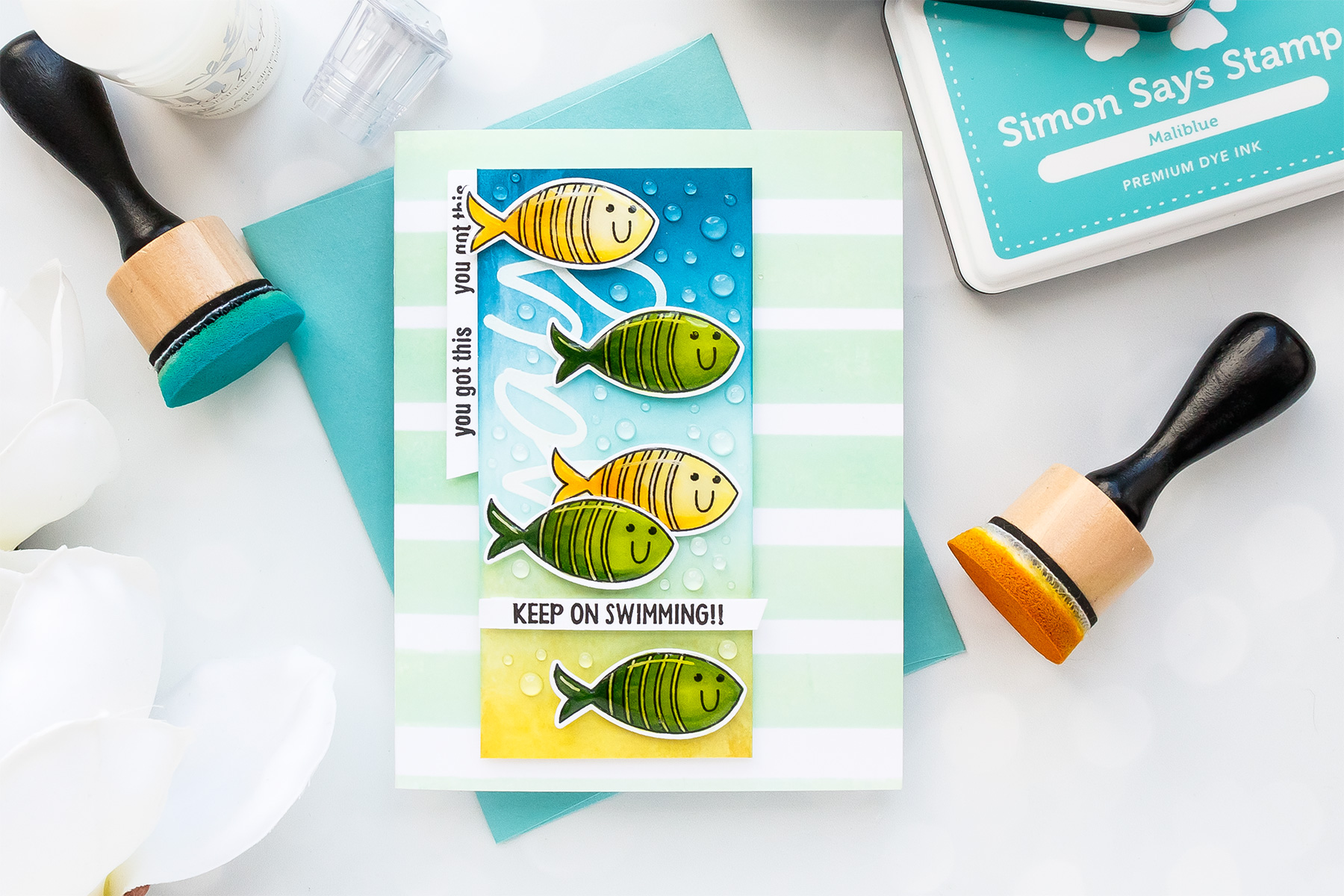
If you’d like to re-create these cards begin by mounting several clear stamps from the Dapper Dad set onto a long clear block to create a strip made up of various images. I used a pair of shoes, a hat, a comb, glasses, watch, bow tie and another paid of glasses. You can add more images or use less if you like. Use Unicorn White ink, its a pigment ink, to stamp this design repeatedly onto kraft paper to create one large pattern.
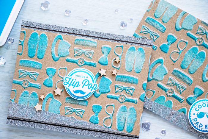
To add some color to the background select another vibrant dye ink color you’d like to have over white, ink up your images (make sure to keep the images on the stamp and not re-mount them) and stamp in color over white, be sure to slightly offset the top layer creating a shadow (for some reason I call it a drop shadow, is that correct?). I used Hero Arts Hybrid Aquatic ink for my top layer, but I have also discovered that Forever Green looked nice.
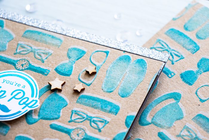
Stamp the round sentiments onto white cardstock and cut them out. I used Pool to Navy ombre ink pad to stamp mine as Aquatic didn’t look quite the same as it looked on kraft. Adhere your stamped patters onto a card base, foam mount a sentiment, decorate with glitter tape and a few wood veneer stars.
BLOG HOP
Come join us for a huge blog hop! Find loads of creative inspiration and win prizes! Hop start on The Hero Arts Blog, if you arrived from the amazing Wanda Guess, you are on the right track! I am the last stop on the hop. If you got lost or found a broken link, please start over on The Hero Arts Blog.
GIVEAWAY
Hero Arts is giving away three $25 shopping sprees, drawn from comments left across all blogs in the hop. Please comment by Sunday, May 15 at 11:59pm PT and Hero Arts will announce the winner the following week.
SUPPLIES
I’m listing the products I used below. Click on the link to go directly to the product. Where available I use compensated affiliate links which means if you make a purchase I receive a small commission at no extra cost to you. Thank you so much for your support!
 HA | SSS |
 HA | SSS |
 HA | SSS | SC |
 HA | SSS | SC |
 HA | SSS |
 HA | SSS | SC |
 SSS |
 SC |
 SC |
 SSS |
You put it perfectly, my dilemma. Thank you.
Super cute as always!
I love the idea of stamping a bright color over white – thanks for sharing!
Love the card♡♡♡
You might be last but your card is first for me. It is awesome – the sand – and all the summer fixings! I love it. Brillant!
A very nice card for any guy looking forward to summer vacay. The effect of stamping color on white could be used in lots of ways.
Love all the new products! that blue on white on Kraft is groovy!
Wow- such a great technique, love the incredible dimension in your background stamping. Thanks for sharing.
Wonderful, love the technique, the background and the blue ink. Thanks for sharing.
what a fabulous technique! The images just sees to pop off my computer screen!
Loved your video…Nice design with these small stamps….
I recognize your struggle for perfection! I can work two or three days on a very clean and simple card while friends of me make a dozen in that time. But this hard work makes your cards really outstanding!!! Love your designs!
Again, so many possibilities! Thanks for sharing!
These are SUPER COOL looking cards – love this technique and you just made cards with dun details and perfect as man cards!! Have a great day!!
Your card is so fun. I love your video. It was nice to know that it takes someone else awhile to finish a card sometimes. Thanks for your inspiration.
Great cards. I love seeing masculine cards. Great techniques. Thank you for sharing.
COOL & CREATIVE cards Yana!!!
THANK YOU for sharing your INKY AWESOMENESS and THANK YOU SO MUCH for keeping it REAL … I confess that I take comfort in knowing that I am not alone in my struggle to transform creative ideas into reality 🙂
I really like this card. This would have been great for my dad years ago but he’s 92 years now. He’s not really a hip pop anymore but he’s a great pop/dad just the same. He can’t do as much as he could do in his 70’s and 80’s or earlier but he’s still an amazing dad all the same. I get what you did but it almost looks fuzzy like you used flocking or something. I am also glad to see that someone takes a lot of time to make a card. Of course, life happens and we can’t just sit down and make a card or cards all day long. I’m a caregiver to my parents so that takes up a lot of my time. However, I am not someone who just makes a card in 10 min. either. Glad to know someone else takes their time to make a card. My cards don’t say Hallmark on them because they are better! LOL Don’t you feel that way too?
Fantastic card & thanks for the video! The challenges of cardmaking are real, but hopefully the recipients can appreciate all the hard work that goes into the cards! :o)
Loved your cards, and loved your video! It’s so refreshing to hear that even the best cardmakers sometimes struggle!
That is a great looking card with the white and color on kraft! I like that you shared the video on the creative process. I always enjoy your videos. It is good to see that the pros can have a long process too.
Yana, thank you so much for sharing this. I often doubt myself because it takes me so long, and several trips “back to the drawing board”, during my design process. Your video showed me that my design process may still take a long time, but I’m in great company 🙂
Nice card